WCPO Dashboard
Research and design an prosecutor transparency dashboard for the Washtenaw County Prosecutor Office to provide better transparency, trust, and accountability of the criminal justice system
Problem Statement
The criminal justice system is complex and lacking transparency, accountability and trust from a public that has a limited understanding of its inner workings. This project serves both the prosecutor's office in informing a data-driven approach to equitable policy change and communicating performance to the public, and external stakeholders in building trust, accountability and understanding of the system to create positive reform. The Prosecutor holds a large amount of influence within this system. The goal is to bring actionable information about the function of the WCPO for both internal and public external use to build trust, accountability and positive reform. The public needs a technically accessible point of entry into prosecutorial data, which can provide substantive insight into the WCPO’s patterns without feeling overwhelmed by the complexity of the criminal justice system or the nuances of the data.
Discovery
The discovery phase involves exploring the problem space and learning about the dynamics of Washtenaw’s criminal justice system and political processes. For this project, we defined our user base as the general public, with particular emphasis on people involved in criminal justice issues within Washtenaw County who may visit the dashboard regularly. During this stage our team conducted stakeholder interviews and comparative analysis of other dashboards. After collecting qualitative data, an affinity analysis of both were conducted.
During this stage our team conducted stakeholder interviews and an affinity analysis was conducted.
Our team also analyzed other dashboards for design brainstorming/ideation.
Define
The team then conducted stakeholder research and gained familiarity with the Prosecutor, the criminal justice system, and political dynamics within Washtenaw County. During this stage our team developed a variety of deliverables such as: empathy maps & personas, scenarios & user journey maps, and storyboards to help translate and generalize our findings and also have a more unuance understanding of how our varying user-types woudld interact with the dashboard during the discover phase.
Our team also ran a card-sorting study to better understand different users mental model regarding the criminal justice terminology and the dashboard's potential information architecture. The first user-population are those with limited criminal justice domain knowledge.
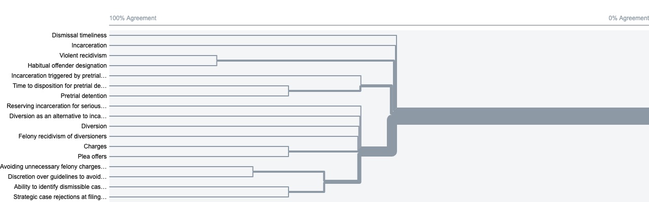
The other user-population are those with more familiar with criminal justice domain and its terminology.
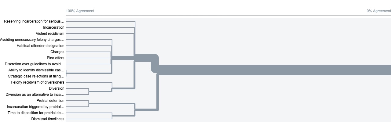
The study shows that the two user populations have different interpretations of what the dashboard's information architecture would be. It also highlights how there is less "consensus" on what the information architecture should be with users with less domain knowledge versus more consensus for users with more domain knowledge.
Overall based on our research, our team found five general findings:
- 1: Users have varying levels of domain knowledge and technical expertise, requiring a dashboard that is accessible to a diverse set of abilities and facilitates learning.
- 2: Many users want a better understanding of how different parts of the criminal justice system and external factors are connected and impact how people move through the system
- 3: Stakeholders have expressed concerns and questions about the biases in the data, and the possibility of the dashboard becoming a political tool.
- 4: Stakeholders believe public trust and engagement is vital for the sustainability of the dashboard.
- 5: Siloing and tensions between organizations make it often difficult for the community to present a cohesive policy vision.
Our report goes into further detail on these findings and how they were discovered.
Develop
The team prototyped different dashboard designs that could help address the issues we defined. Based on user feedback, the team re-iterated the prototype until we settled on specific features and layouts and assembled a final dashboard design. Our team first made some initial sketches which were utilized to create an initial prototype of our dashboard.
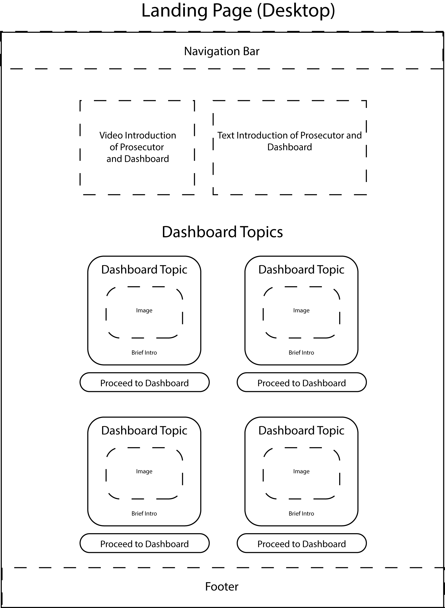
These sketches were then further developed into different versions, utilizing user-flow charts to analyze our different versions
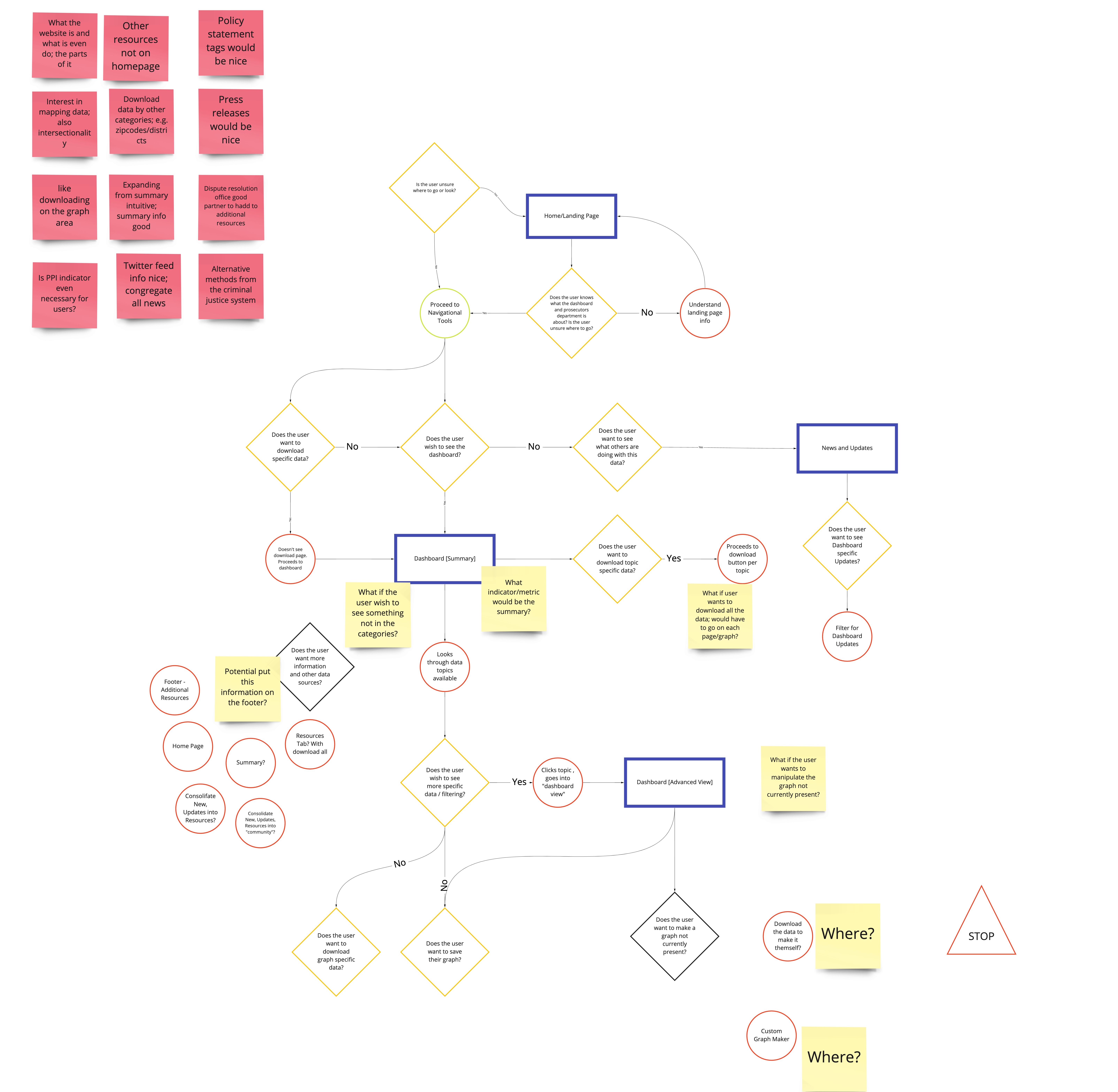
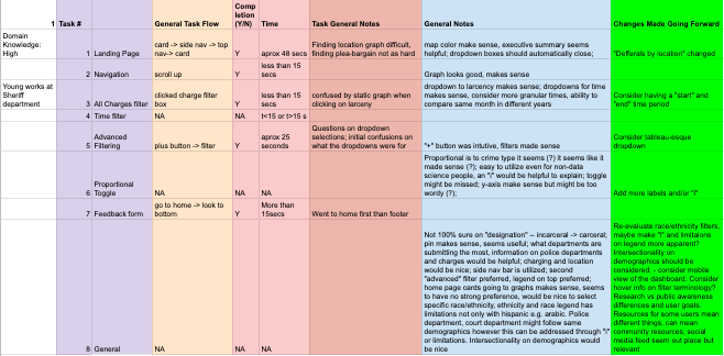
Our team then developed an initial prototype. This initial version was then utilized to conduct a usability test and some informal feedback sessions.
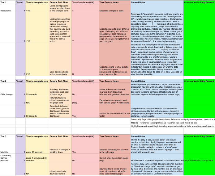
After receiving these feedback, our team iterated our prototype and created a new, second prototype utilizing the feedback we received. Our team then conducted another usability test on this second prototype and utilized the findings from this second usability test to help develop our final prototype version.
Based on our findings, our team made some recommendations to address these findings and how the final design should address them. Some of the recommendations are:
- 1: Focus on allowing users to go into depth with actionable information over breadth of data topics.
- 2: Following accessibility best practices to accommodate a range of abilities
- 3: Using multiple forms of representation and scaffolding to facilitate users using the dashboard.
- 4: Creation of an interactive online flow-chart of parts of the justice system to educate the public about the process, factors impacting it and the levels of prosecutor influence.
- 5: Include additional data resources
Deliver
Based on user feedback, the team re-iterated the prototype until we settled on specific features and layouts and assembled a final dashboard design. Our team created a final report that's over 50 pages that goes more in-depth on our team's research and design for various stakeholders. Our team also developed a working prototype for software developers to better understand our design solutions.
*Our report goes into further detail how our initial research findings are manifested in our prototype.
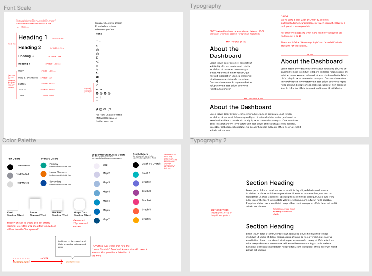
Our team also created a design guide for the front-end dashboard developers.
Lastly, a competitive analysis of different data visualization tools to help stakeholders select which one would be appropriate for this project.